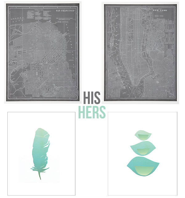
My husband Mike and I see eye to eye on a lot. When it comes to interior design, there’s a bit of a divide. Home decorating can be intimidating for me to begin with-the monetary commitment, the measurements, the aesthetic. It’s all just too much sometimes. Which is why 80% of our walls and 70% of our rooms have gone pretty sparse for pretty long. The other day we set out to make some magic happen, and we did. We got a lot done-new chair, new coffee table, new ottoman, and in the frenzy of it all we purchased these map prints from Crate and Barrel. Mike really loved them for their meaning as much as their design-we first dated in San Francisco and New York has become a second home to him now through his work travel. In the store, I loved them too. But when we got them up on our walls I started to lose that lovin’ feeling. The thing is unless you’re right up close to them, they tend to look like just a dark rectangle. So I started to search for something a little softer, a little prettier. Something suited more for a living room than an office, which I think these would be amazing for. Sadly, Elle now sleeps in what used to be our office. These feather and bird prints I love are from One Kings Lane. And so the delicate debate begins. I’ll keep you posted. Until then, I’d love to know-how do you and your living partner (s) merge styles?
San Francisco and New York prints, Crate and Barrel Prints are on sale in store now
Feather and bird prints, One Kings Lane


What if you combine the cool green/blue color of the feather & bird print onto the map prints? Perhaps a design that merges the two interests into one.
Yes, a happy medium would be ideal. I said we should keep the prints, just re-position them. Maybe to a wall where you’re forced to be up close so you can better appreciate them.